Louis Vuitton
E-commerce - AKQA Paris
Exploring the digital expression of a luxury brand, where exclusivity, storytelling, and product presentation are central. As part of Louis Vuitton within LVMH, the challenge was to translate a high-end retail experience into a refined digital environment.

Structured product discovery.
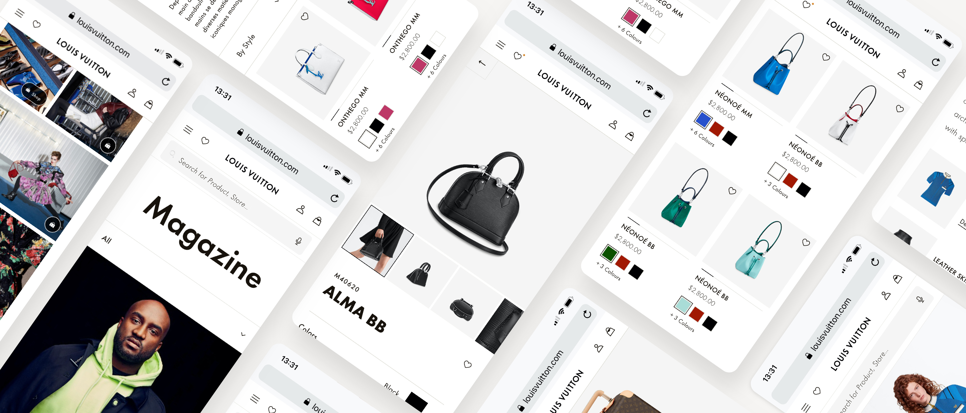
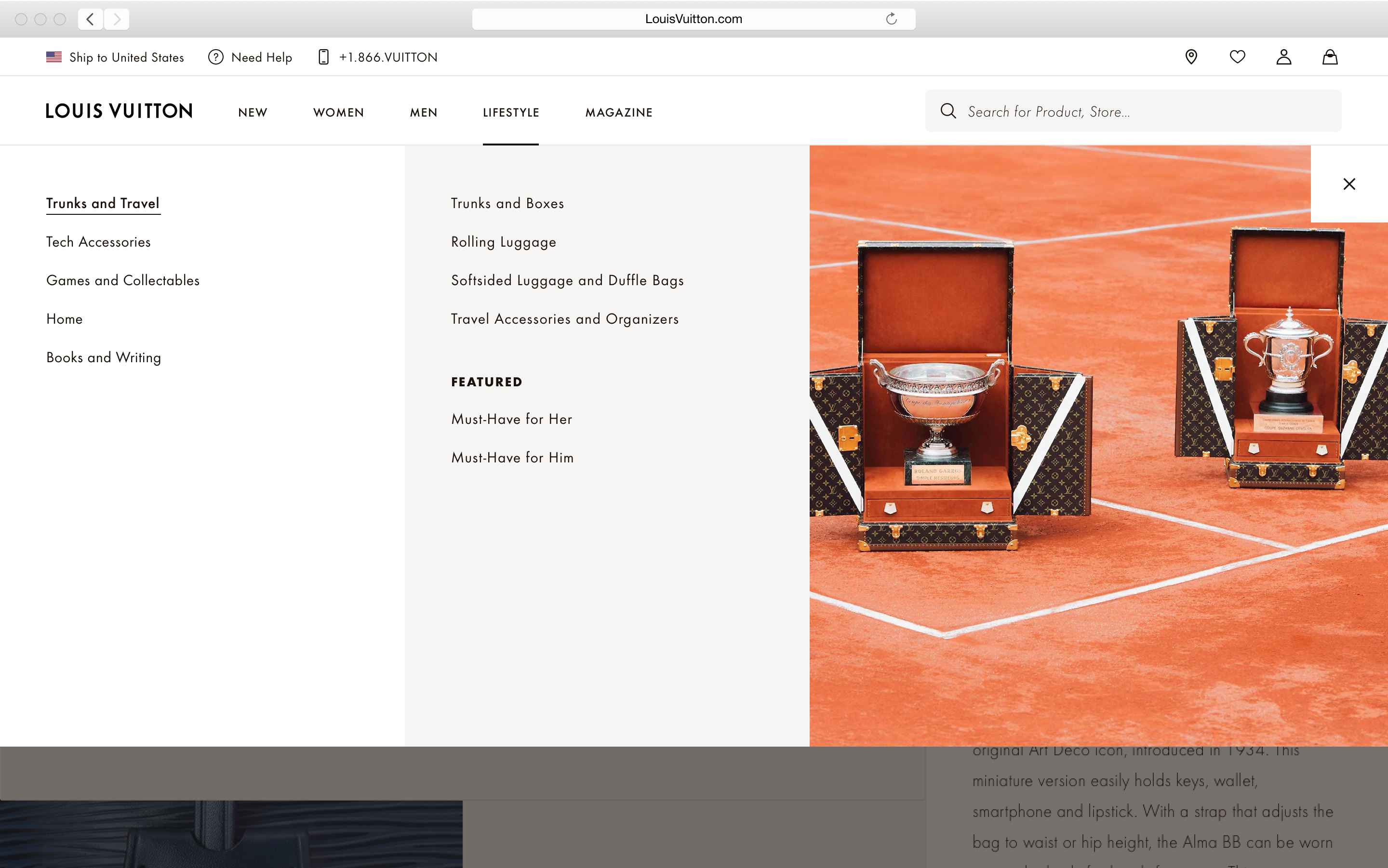
Navigation and product access were designed to remain minimal yet efficient. The structure prioritizes clarity and focus, avoiding unnecessary complexity. Users can explore collections fluidly while maintaining a sense of control and orientation.

Balancing emotion and function.
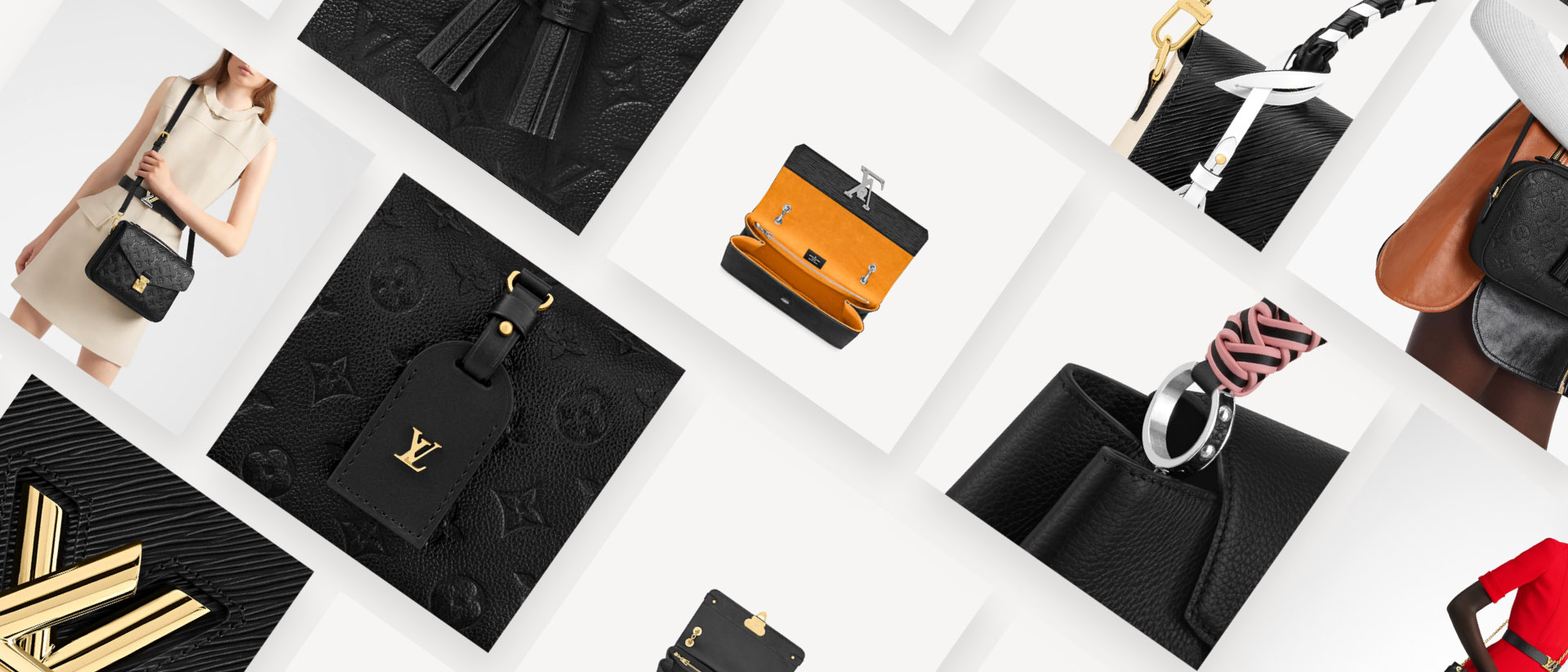
Product pages combine immersive visuals with essential information. Content is carefully structured to highlight craftsmanship, materials, and key details without overwhelming the interface. This balance ensures that functional needs are met while preserving a sense of luxury.
UI elements are designed with a high level of precision and restraint. Interactions are subtle, reinforcing the premium feel without drawing attention away from the content.

Optimizing checkout through user insights.
The checkout experience was treated as a critical step in the user journey, where clarity, trust, and efficiency directly impact conversion. Extensive user testing was conducted to better understand behaviors, expectations, and points of friction across different markets. These insights informed a streamlined and reassuring flow, designed to reduce drop-off while maintaining a premium experience.
It was then adapted for 23 countries, each with specific steps, payment methods, and regulatory constraints. This required a flexible and scalable system capable of handling localized variations while preserving overall consistency and usability.

It's not just about shopping. It's also about discovering.
The Magazine, the new LV Now, is split in several sections to discover new creations, fashion shows, campaigns, or exhibitions and artists of La Fondation Louis Vuitton. All you need to be inspired and connected with the world of high fashion.

Design system and craft.
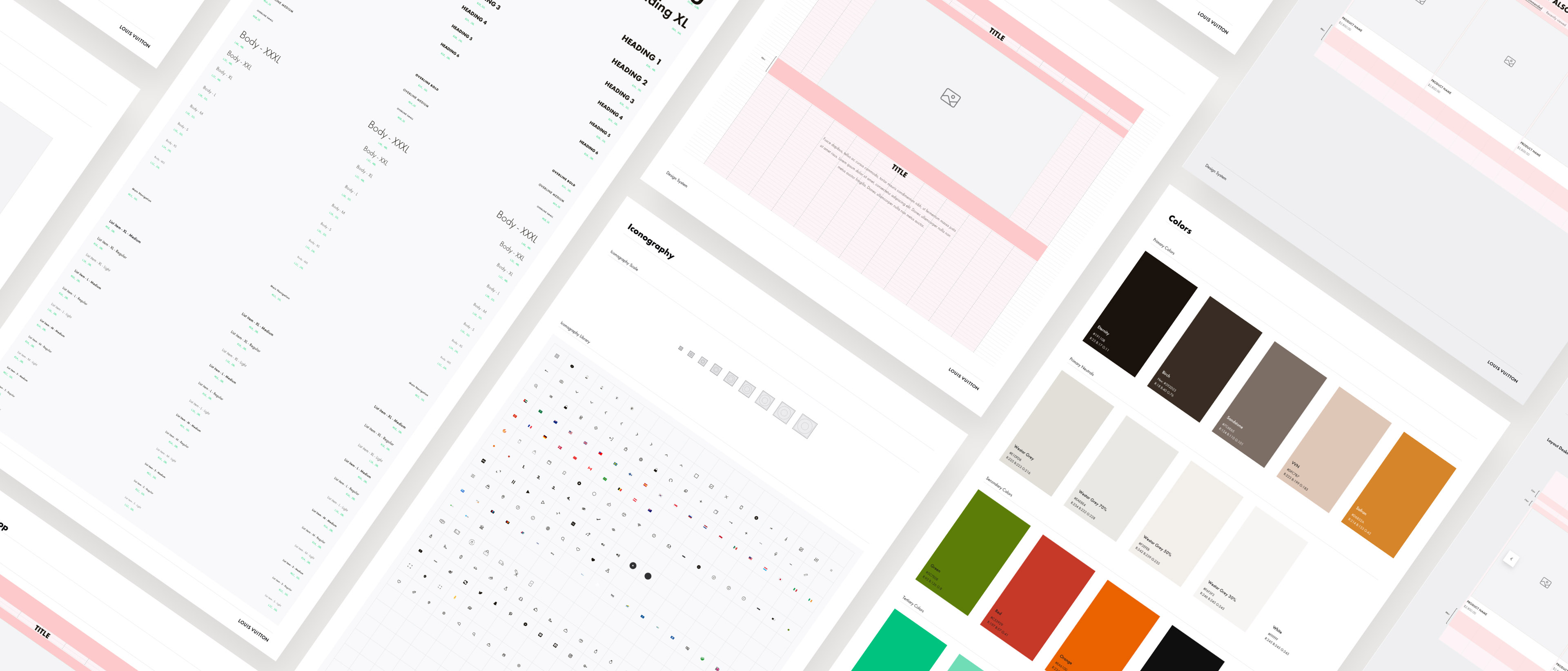
A consistent design system ensures alignment across pages while maintaining flexibility for campaigns and collections. The system supports a refined visual language rooted in simplicity and elegance. This approach guarantees long-term consistency across the ecosystem.

Every detail contributes to a cohesive experience.
Louis Vutton e-commerce demonstrates the ability to design within the constraints of a luxury brand, where every detail contributes to perception and value. It reflects a product approach focused on clarity, storytelling, and precision, translating brand identity into a cohesive digital experience.